Colour Is Power: Use It To Build Your Brand
Red and yellow: colours of power and vibrancy. Colours of McDonalds. Green: a soothing and comforting colour. The colour of Starbucks. White: clean and minimalistic. The colour of Apple.
The visual appeal of colour is something that has always been used in branding and marketing. Colours, and their ability to elicit emotion from people, are a great resource whether you’re shaping or introducing your brand. The way that brands speak with colour goes a long way to establish their identity and certainly remains memorable to their audience.
So, what are some ways that brands can use colour to their advantage?
- Decide on a colour palette for your brand
This might seem like a simple task, but you’d be surprised how many brands don’t have a colour palette that they adhere to.
First, ask yourself: what is the impression I want to give to my audience? How do I want my brand to make them feel? Are my products more of a sleek black and white, or a whimsical pastel pink and purple?
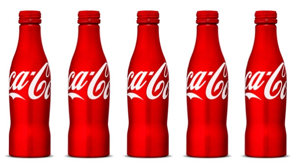
One brand that does this well is Coca-Cola, which has become synonymous with the colour red.

If you’re not sure where you want your brand to stand on the colour spectrum, you can always look to existing brands for inspiration. One good way is to find out what colour has not been taken in the industry that your brand is in.
- Know your audience’s preferences
Of course, what would the colours be without your audience to see them? You are, after all, trying to appeal to their visual nature. And if there is a specific audience that you are appealing to, step out of your shoes as a marketer and think about how you would view your brand from their point of view.
Research has shown that blue is the most universally-popular colour, regardless of gender. Brands such as Twitter and Facebook have certainly played this to their advantage.
Age could also possibly play a part in preferences, as younger audiences may prefer more vibrant colours while older audiences may be drawn to slightly more muted tones.
And then there is culture. Not all colours are universally accepted, and some may have repercussions in different societies. Such knowledge may go far to help you distinguish your brand.
To best know what colours work, an A/B test can always be conducted to determine which option gets higher conversions and click-through rates.
- Make sure you stay consistent
Your colours are only as useful as your commitment to them. To effectively build your brand, you will need to consistently remind people of the colours that you want to be associated with. This means everything from landing pages to call-to-action buttons. Stick to a uniform colour scheme and you’ll be sure to start seeing your audience associate the colours to your brand.
- Don’t be afraid to use clashing combinations
Making a bold statement? If you’re trying to prove that you’re a new force to be reckoned with, then brighter colours like yellow and orange will certainly be more effective than dull blacks and greys.

Many companies are afraid to take risks with their colour schemes, but if everyone sticks close to the wall, then maybe it’s time for you to stand out and be different.
Remember: colour is power, so don’t let it go to waste!
To get stories like these delivered straight to your inbox, sign up for RICE’s newsletter!
